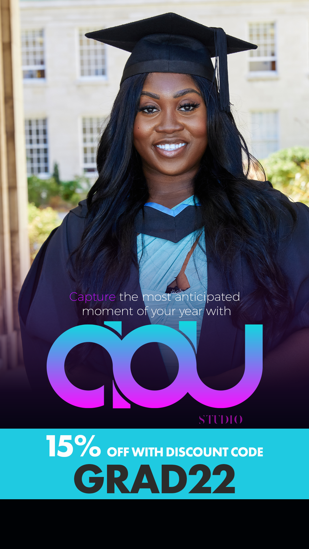
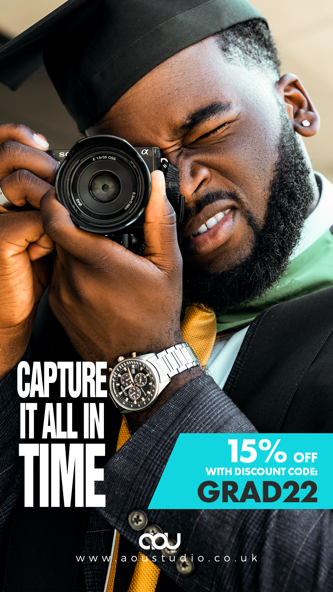
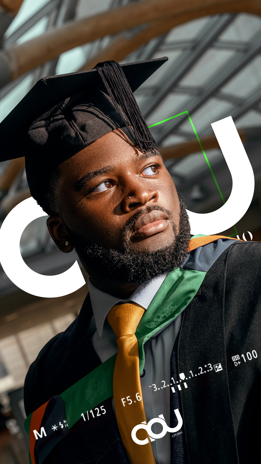
This project was one of my favourites because I was given something rare: creative freedom. The owner of AOU Studio trusted me to shape the brand from scratch, while still working closely with her to make sure everything aligned with her vision.
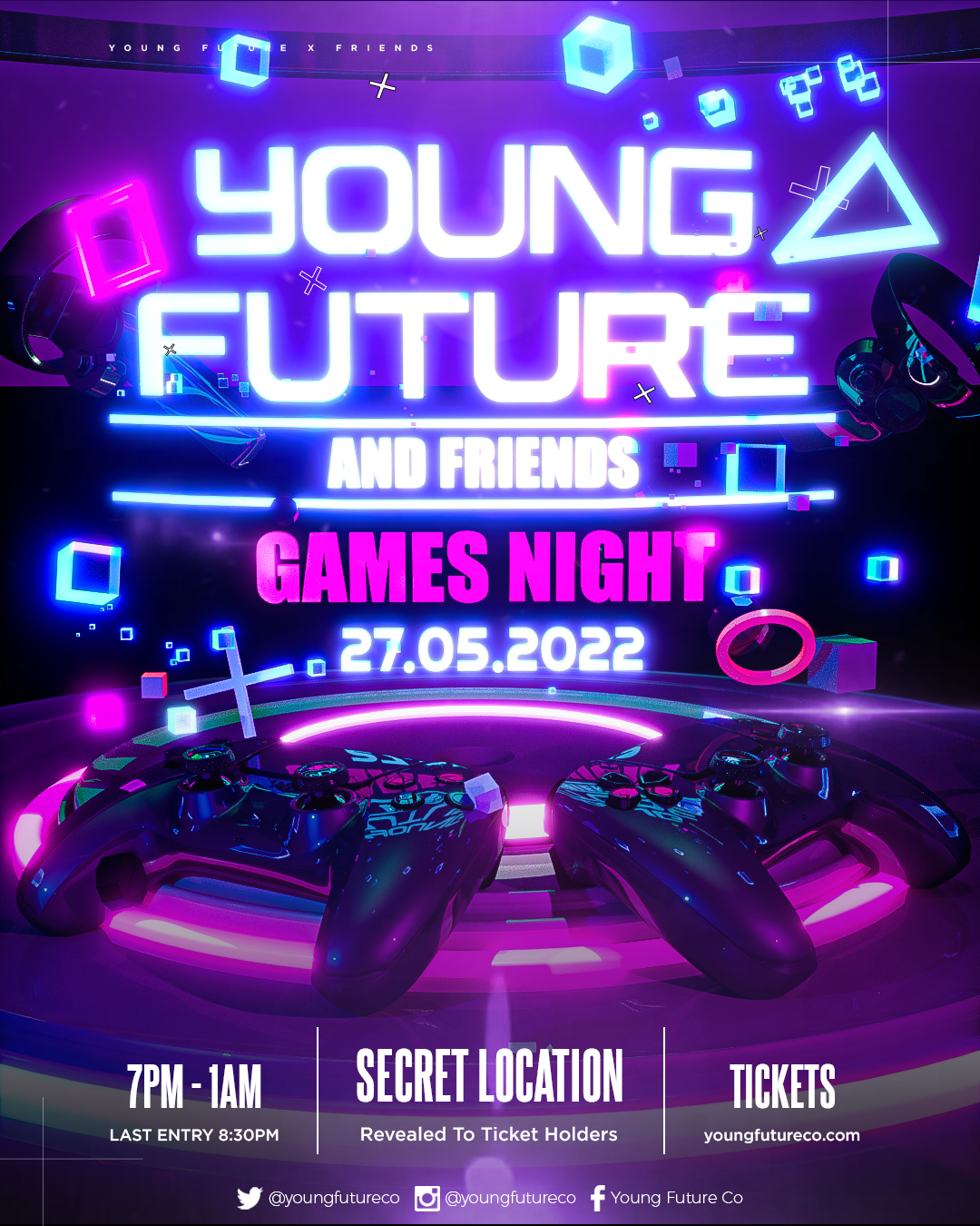
The design request was for a bold simple design. I was inspired by the Sony Vaio logo where its words flowed; the logo initially to look like a camera with the play of words. over the iterations designed we opted for the the logo seen.
The challenge was to design something minimal but memorable, an icon that could stand alone yet still feel part of a larger system. I refined it into a clean, confident mark that now anchors the studio’s identity.
The AOU Studio identity is built around two bold core colours: Magenta (#f511ff) and Cyan (#16d3e0). Magenta injects energy, creativity, and individuality into the brand, capturing its bold and expressive spirit. Cyan balances this with clarity, trust, and modern professionalism, ensuring the brand feels approachable and reliable. Together, the pairing creates a vibrant, futuristic identity that reflects AOU Studio’s vision—fearlessly creative while grounded in clarity and collaboration.
I used the identity of the brand as a photography service I played with the UI elements seen on a digital camera; experimenting with the typography, layout and visual flow
The final branding and design suite establish a strong identity that is both functional and expressive. From colour to logo to print, the visual system gives AOU Studio a distinct presence that resonates with its audience and sets the tone for its creative journey ahead.
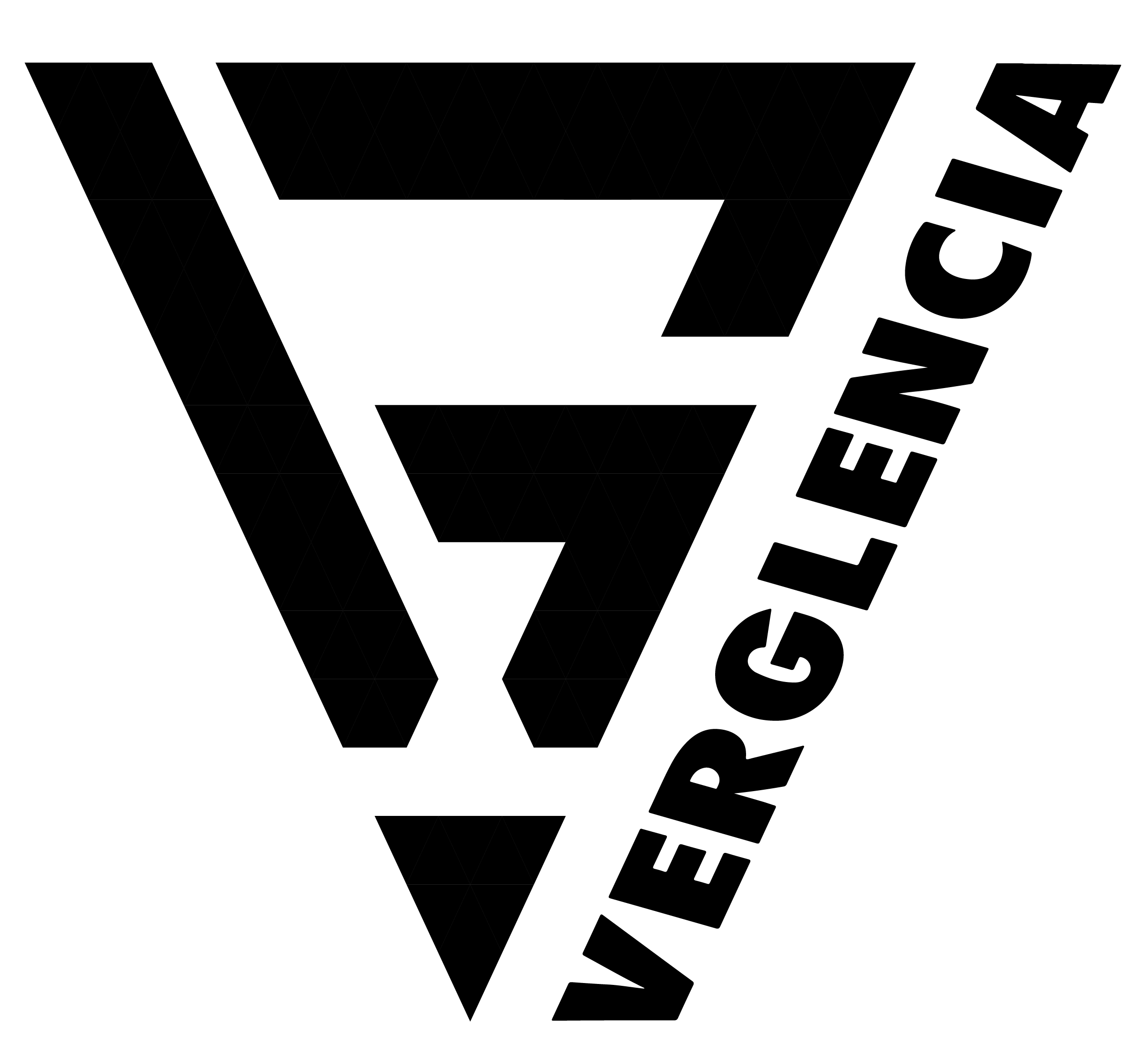
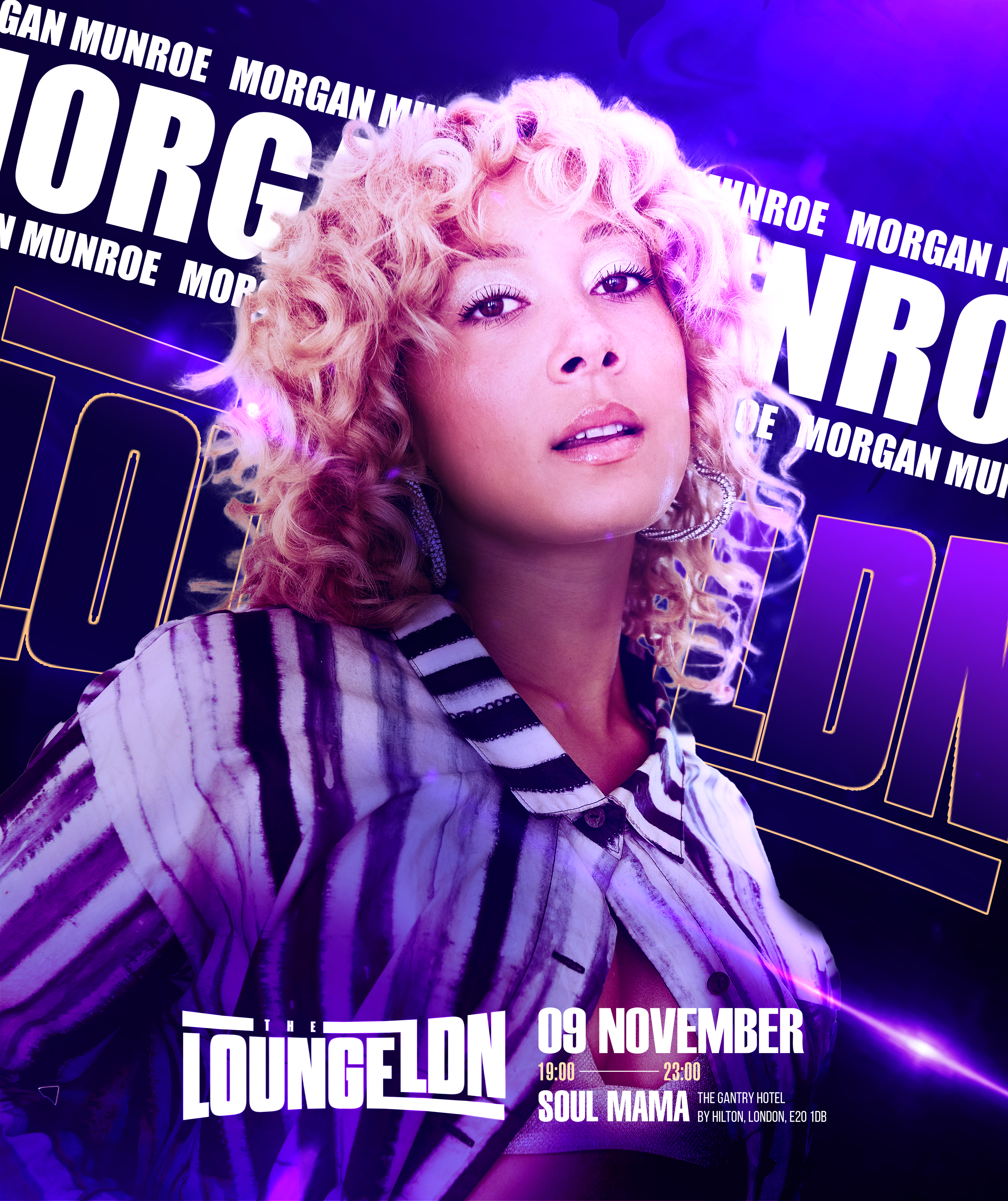
At Verglencia, freelance digital media design, illustration and photography specializing in modern urban and surreal designs. Merging photography, 2D and 3D elements through digital mixed media, they craft compelling visuals for illustrations, promotional material, websites.
Never restrict yourself to one medium of art. Once focused only on illustration, now venturing into event photography, ideally my journey is to lead me to concert photography. Join me on this journy